lhw
Introduction to Hotglue
Research
Portfolio Development
Before I went onto Hotglue and started making the portfolio, i turned to my notebook and started deciding the scope of the project and drawing wireframes. These two planning stages are useful as they save time in the development stage as you know what you are making and how you want it to look before you start making the project.
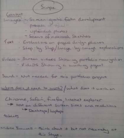
This outlines the scope of my project, what content I intend to put on the site and where my site needs to work. With a lot of web browsing moving towards mobile devices like phones and tablets, I needed to make sure that the website looked appropriate on the smaller screens that accompany mobile technology without making the website look out of place on laptops or desktop monitors.
I also had to ensure that my website worked on all major internet browsers, including Chrome, Safari, Firefox and less importantly Internet Explorer.
Adding to the scope of the project, I also took into consideration who this portfolio is aimed at and who will be looking at this website and that decided the look of the website. I expect my course leader Daniel Buzzo to look at the portfolio along with any protential future employers or professionals and therefore wanted to design a website that looked professional and not something that looked like it was to be shown to only friends and family.
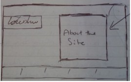
After writing up the scope of the project i had a better idea of the design and what it should look like and what content should be put onto the website. The next step was to produce wireframes. Like i said before, producing wireframes is a way of reducing time in the development stage and in the real world with project development would save time and money as you spend less time playing with the software as you know what you want the website or portfolio to look like and so can get on with useful development.
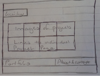
Above is my first design for the homepage of the portfolio. This design adds a lot of width to the website and that would therefore create some issues with viewing the website on other devices, importantly mobile devices and would mean the user would have to scroll left and right to see all the information on the screen. This led to the second design (left) which takes the format of the 'leemasondesign.com' and 'mikekus.com' (both can be seen on the research page - link above) and has the project links on the homepage with images of the project. This eliminates the side-scrolling that was problematic with the initial design as you can extend the project images down instead of side ways.
The final homepage design i went with differed to this sketch. I recieved feedback that some people didnt know what they were looking at with the homepage as they didnt recognise the logos, so i decided to put a description of the project next to the logo to help users access the information they want to see.
Portfolio
This is the final Homepage for my hotglue website.
I decided to separate the pages for the intro, research and portfolio development pages. This was to prevent too much information being on the same page and to allow the user to find what they want quicker as they can go to the research page without having to reading through the intro page or the development page.
Here are two images from mobile devices. The far left being my Sony xperia Z3 compact mobile which has a screen size of 4.6" and to the right of that is an Iphone 5S which has a screen size of 4" and as you can see the homepage displays fine on both devices without any scrolling required.